Safeback Brand ID
Shaped the Safeback brand ID from idea to launch — including naming, visuals and tone of voice for a trusted, high-performance safety product.
Introduction
SAFEBACK x LIA
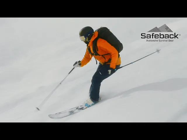
Award-winning safety device designed to increase survival in avalanche and mountain emergency situations. Helping you back safe.
Deliverables
Naming, logo design, byline, product graphics, graphic elements, infographics, art direction on renders and infomercials.
Scope
Supporting a startup’s entrepreneur and development team with brand identity and creative copywriting, with a primary focus on brand development, alongside the product innovation process.
I was involved from the very beginning, developing a complete brand identity including naming, logo, tone of voice, product graphics, packaging, animations, user guides and other branded elements. The goal was to create a modern, robust and trustworthy brand with real-life relevance.
Credits
Product Design: Eker Design
Art direction & graphic design: Magnus Lia
Rendrings & ilustrations: Eker Design
Photo: Safeback, Eker Design, Db, Bergans
Explanation video: Safeback
Visit:
Safeback


Objectives
The project needed to communicate innovation, reliability and safety.
The brand had to appeal to both alpine professionals and recreational users, all while aligning with the functional demands of a life-saving product - without leaning on clichés or fear-based messaging. Visuals and messaging needed to balance emotional resonance with technical precision.
Logo construction:
The Safeback logo is constructed with reference to a key alpine principle: slope angle as an indicator of risk. Below 30 degrees is generally considered low-risk terrain, while slopes above 45 degrees are typically classified as no-go zones due to high avalanche danger. The logo’s geometric form can, in principle, serve as a visual reference or reminder of this threshold when no other measurement tools are available though it’s important to note that snowpack, weather and terrain traps can significantly affect safety, regardless of angle.


Solutions
Working closely with the founding team, engineers and product developers, I contributed from concept sketches through to user testing and launch.
The identity system combines clean typography, distinct product graphics and intuitive user guidance. Every visual element is designed to reinforce trust, clarity and readiness from packaging and on-device graphics to animations and manuals. The result is a consistent and functional brand that supports both first-time users and experienced mountain professionals.
The brand has since become a success story in its segment, earning strong market recognition and multiple prestigious awards for product and innovation, including the Red Dot Award.
Explore, play safe — and get back breathing


